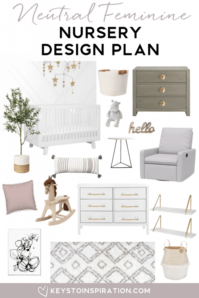
See the full design plan for our neutral feminine nursery. A bright and casual room perfect for a new baby girl.
Want more room designs? Check out the design plans for my modern classic home office, our master bedroom, and our powder room.
PS: Thank you all so much for sticking around while I took an extended period of time off during my pregnancy and maternity leave. I appreciate all of the love and support from my readers.
One of the things I was most excited to do after finding out that I was pregnant was getting to design a nursery.
Up until this point, the room in our home that we wanted to turn into the nursery has been a “junk room.”
The photo below is from move-in day. Other than that one photo, I haven’t really shared the room on the blog because it’s basically a messy storage room.
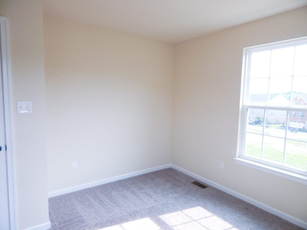
I’m so glad we can finally turn it into a usable and beautiful space.
Before I even started my baby registry, I started looking at nursery ideas and pinning away. I wanted to design a neutral space that would fit in with the rest of our home style.
I’ve never been a fan of the typical nursery designs. You know the ones that have a “theme.” That’s just not my style.
Instead, I wanted a room that was polished and put together, while still feeling light and fun. After all, it’s going to be a kid’s room.
I started making a design plan for the overall pieces for the room by sticking with a neutral theme. I figured I could accent with pieces that would make it more gender-specific once we found out what we were having.
Once we found out that we were having a baby girl, I shifted gears a little and started adding in more feminine elements.
I had so much fun creating this room design! I can’t wait to share all of the details with you.
Neutral Feminine Nursery
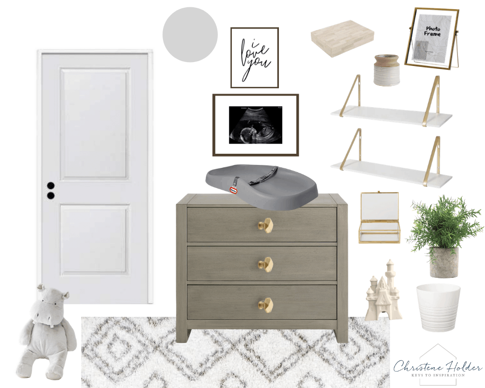
I created 3 design boards for this room. Each one showing a different area or view of the space.
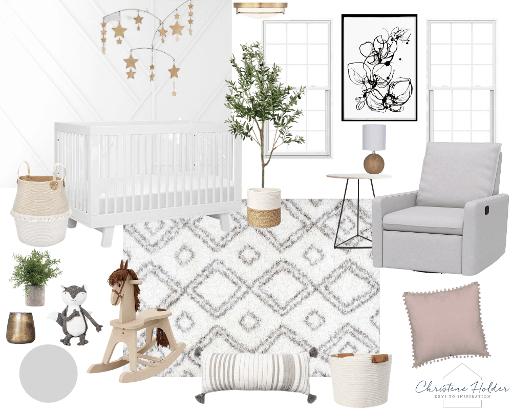
Overall, there’s going to be a lot of white and gray in the nursery. Those colors will give the room a neutral base.
I also want to incorporate texture with soft textiles and some warm wood tones.
To make everything feel feminine, I’ll be accenting with gold in the hardware and some accessories. I’m also going to include a little bit of pink here and there.

Normally when I’m designing a room, I stick with a loose design board for inspiration. Then, I pull together the elements over time. I like to collect things and design at a slower pace so that the room comes together naturally and not forced by some design deadline.
This time, I had more of a deadline because of my due date! So I took a different approach and added a lot more details to my design plan.
Focal Point
When you’re designing a room, I think it’s important to have a main focal point. Something that your eye is immediately drawn to when you step into the space.
The main focal point of the nursery is going to be a modern white accent wall.
I have a thing for accent walls (see our dining room and master bedroom). Up until now, we’ve gone a little more traditional. But for the nursery, I wanted to create a modern accent wall.
I debated painting the accent wall a darker color. But ultimately, I decided to stick with white, which I just love!
For the rest of the walls, I’m choosing a soft gray color which will contrast with all the white.
Furniture
When you are choosing furniture for a room, you want to look for pieces that are both beautiful and functional.
It took me a while to decide on the large furniture pieces for the nursery, but now that it’s coming together I’m really happy with my plan.
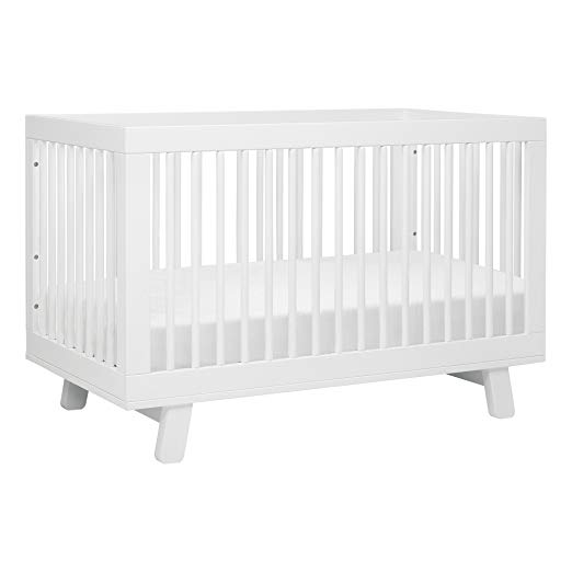
I knew that I wanted a clean-lined, simple white crib. Something that would look good layered against the white accent wall without competing visually. This one was my favorite. It’s also convertible, so it will turn into a toddler bed in the future.
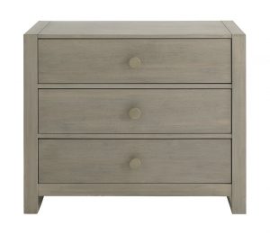
For the dressers, I needed one to store clothing and one to act as a changing table with storage. I didn’t want to go with all white everything, so I decided to mix in a grayish wood-tone dresser.
The white dresser is going to hold all kinds of clothes. I want to replace the simple knobs with these gold modern handles to make it look a little more high-end.

The gray wood-tone dresser will be a changing table on top and has tons of storage for diapers, wipes, and all kinds of other gear. I’ll also be changing the knobs on the drawers to these pretty geometric gold knobs.
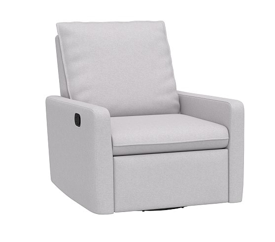
One piece I knew I wanted to splurge on was a really nice nursing chair. This glider chair is so comfortable and the color is perfect! I got to try it out in stores and it’s so nice! Yes, it’s a little pricey, but it will last for so long. And it looks like a regular piece of furniture and not just a glider.
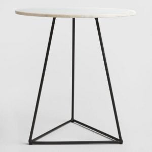
I love this little accent table that will sit right next to the glider. It’s got clean lines and a pretty marble top.
Decorative Pieces
Once you have a base design for a room, you can layer in decorative pieces to make everything come together. I like to keep the overall base of my room designs neutral. Then I can bring color and personality in with the decorative pieces.
I’ve had my eye on this beautiful gold mobile. I think it will look so sweet above the crib and against the modern accent wall. I love the little stars!

On the walls, I wanted to include a few pieces of framed art.
The biggest piece will be this beautiful abstract floral print. I’m going to get it printed in poster size. It looks like an abstract art piece, but the subtle floral elements make it feel feminine and perfect for a baby girl nursery.
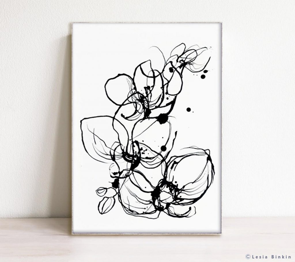
Above the changing table, I am going to hang two frames in different sizes. The first is going to be a simple art print that I designed myself. You can get it here!

Below that, I want to frame one of the ultrasound images of our baby girl. To make it feel modern, I’m going to keep a large mat around the image. I think it will be so special to have the ultrasound image in her nursery.
I’m also going to be hanging these pretty white and gold shelves on the side wall next to the changing table dresser. The dresser is in a nook area of the room, so there’s a small wall that will fit these shelves perfectly.

On the wall with the white dresser, I’m going to have a large gold mirror. This one is slightly different than the one in our powder room. It’s a wooden frame that’s a little bit thicker. The gold will really compliment the other gold accents in the room.

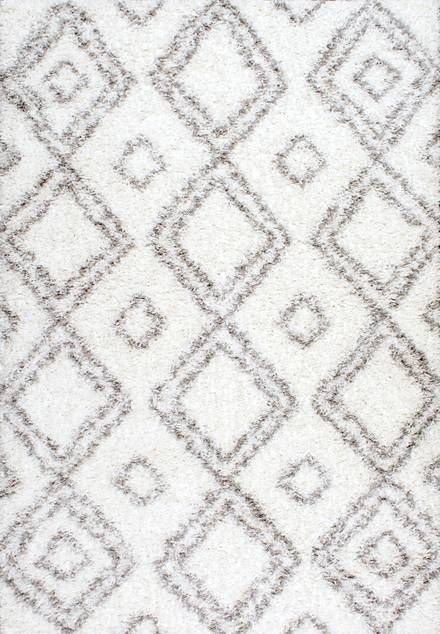
I debated so many different options for rugs and couldn’t find one that I really loved. Then, I stumbled on this one.
While I’m not normally a fan of big patterns, I think this one will be subtle enough in real life. I like that it has a geometric style and it’s also super fluffy, which will be perfect for the nursery.
I saw this amazing olive tree and I knew I had to include it in my design. I’m also going to get a neutral basket for the base of the tree. I think it’s going to look so cute in the nursery and bring in some “life.” That’s why I love decorating with greenery!

I’ve collected a lot of other decorative accessories for the nursery like pillows, baskets, and even some cute stuffed animals. I can’t wait to style everything!
Personal Touches
Before any room design is complete, it’s important to add in unique, personal touches. They give the space character and spirit that you can’t just buy from a store.
Personal items are so important because they make the room feel like it’s a part of your home – not just a generic room in a model home. Personal items give a room design your unique style and story. And that’s just as important as all of the other design elements.
The ultrasound photo that I talked about before is one of those personal touches I’m adding in the nursery. I also want to add a few other framed photos from my maternity photo session.
A few years ago, Ben and I were shopping at an antique store near our home. I found a beautiful wooden rocking horse. We weren’t ready to have kids then, but I couldn’t pass it up. So it’s been sitting in storage since then.
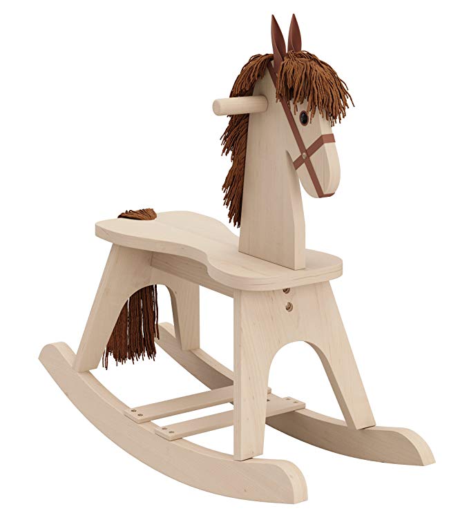
I’m excited to incorporate it into the nursery for our baby girl. I’m pretty sure it’s not actually an antique, but it’s special to us and has a story behind it. And that’s what’s important when you add personal touches to a space.
The rocking horse that we found looks just like this, but the wood finish is much darker. I thought about painting it, but I kind of like the warmer wood. It’s a slightly traditional piece mixed into my modern room design. I also love this lighter wood version if you are looking for something similar.
This letterboard is what we used for our baby announcement photo. I am going to use it again in the hospital when we get our fresh 48 photos taken. I want to keep it in her room as a memory piece.

Another personal item that I’ve had in storage for a while now is this cute ceramic castle. I bought this a long time ago from the Disney website. I just thought it was cute at the time for my post-college apartment.
After we got married, I wanted to save it in case we ever had a baby girl. I thought it would look so pretty in a nursery. It’s also a nod to my love of Disney parks!

On the shelves over by the changing table, I’m going to include this pretty glass and gold box. My plan is to keep our hospital bands inside and on display. It’s a cute personal touch that I know I’ll cherish for years.

I’m so excited to see how the nursery comes together!
Sources
You can shop any of the pieces in my nursery design plan by clicking on the images below.




Christine, I just found your blog, through a Pinterest pin. I am way past time for designing a nursery. But I enjoyed seeing what you are planning pray all is well and looking forward to when you are up to posting. Blessings
Thanks Glenda! Glad to have you here on the blog 🙂
>> Christene