A whole house paint color palette grays, blues, and neutrals for a modern, classic, and calming home.
Want more home improvement projects? Check out these posts.
This post contains affiliate links for your convenience. For more information, see my disclosures here.
Choosing paint colors for your home can be really confusing. I remember when we first moved into our home, every wall and all of the ceilings were yellow!
Here’s a look back at the builder grade paint that came with our home.
I was so ready to paint and make it feel more like my style. So I went straight to the home improvement store and started looking at all of the paint chips.
There I was standing in the paint aisle – completely overwhelmed with how many options there were! I probably grabbed about 20 different paint chips to take home and try to decide what would work best.
I ended up using Pinterest to search for some of my top paint color choices to see what the shades actually looked like in real homes.
It was so helpful to see the paint on the walls of someone else’s home. I was able to visualize how the paint might look in our home.
Thankfully, I was able to narrow down the options and make some decisions to start getting paint on our walls. And over the years, we kept painting until the old yellow was banished from every room in our home.
Whenever I share photos of our home, or even when friends stop by in person, I always get questions about the paint colors we used.
So I thought it would be helpful to round up all of the paint colors that we’ve used in our house so that they’re in one convenient spot.
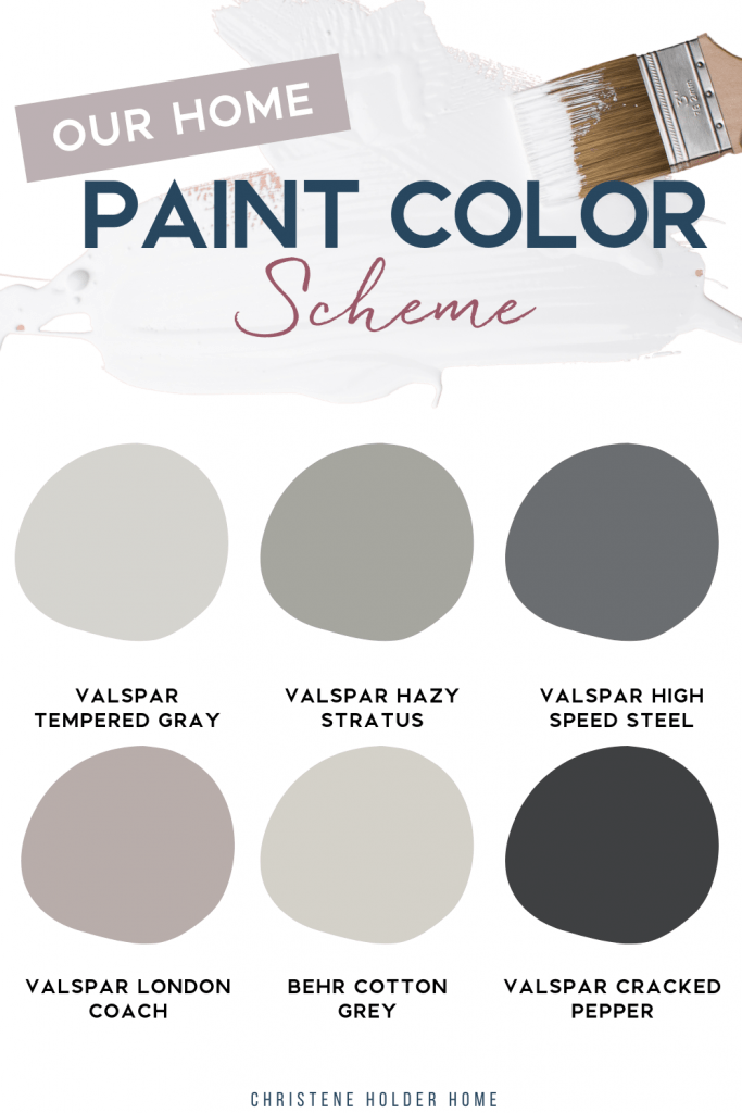
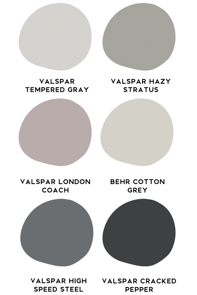
Looking at all of the colors together, you can start to see the base color palette of our home.
I definitely used a lot of gray in this house. And looking close, you can see that there are some undertones of blue, pink, and even green.
All together, these colors help me create a neutral base for our home. One that I can layer with decor to create that modern classic look that I love.
If you’re looking for some ideas for paint in your home, here’s all of the paint colors that we’ve used.
Our Home Paint Color Scheme
1 – Valspar Tempered Gray
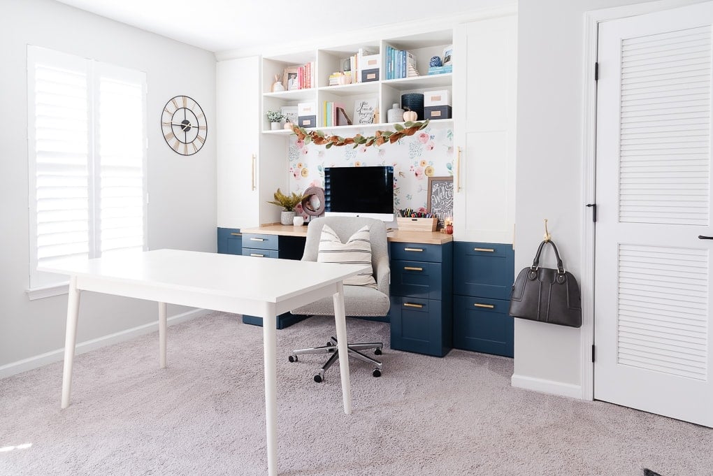
This shade has been our go-to paint color in this home. It’s a very light gray with blue undertones. Depending on the light, it can look more gray or more blue.
I love that it’s light and bright because it helps make our small home feel bigger.
We’ve used this shade in our living room, basement, master bathroom, guest bathroom, and downstairs stairwell and hallway.
2 – Valspar Hazy Stratus
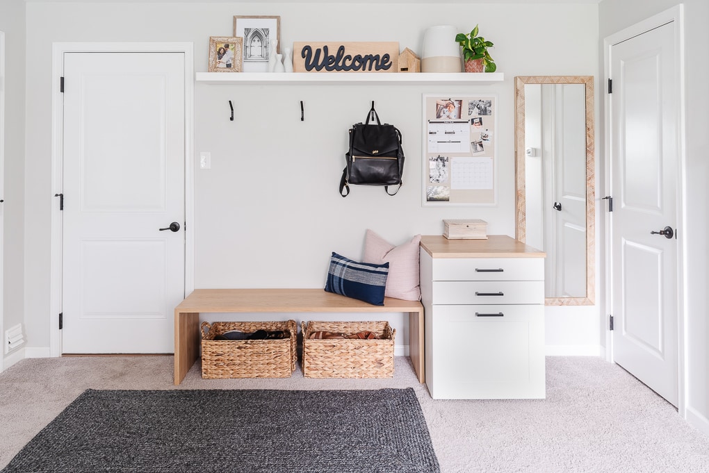
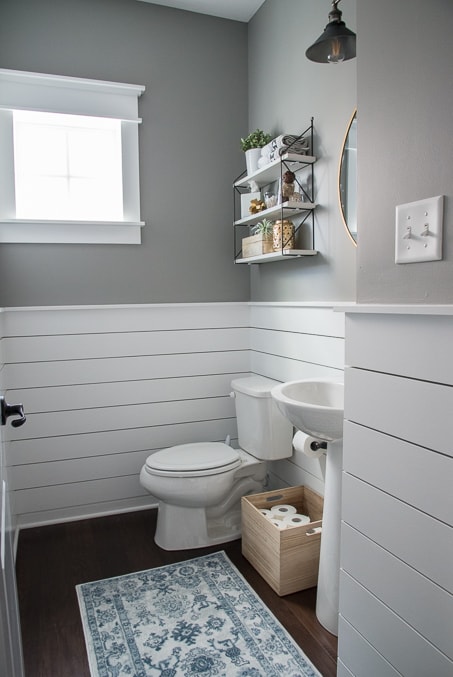
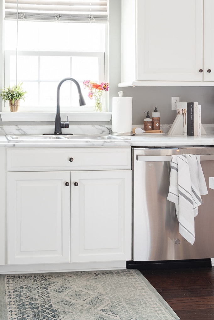
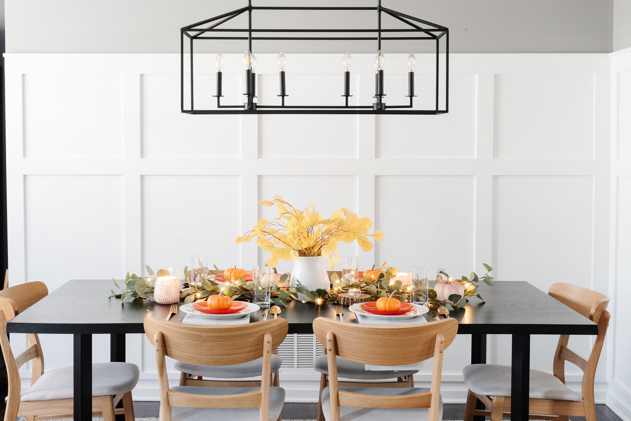
This shade is probably the paint color I get asked about the most! It’s a great true medium gray tone with a very slight green undertone. But most of the time with the lighting in our home, I never really see any green. I love the warmth it provides and the contrast too.
We’ve used this shade in our kitchen, dining room, powder room, and upstairs stairwell and hallway.
3 – Valspar High Speed Steel
This shade is one you might not recognize because it’s only in a very small area of our home. Originally, I used this paint in our dining room to try and designate it as a separate space from the kitchen. But, it was a little too dark, so I ended up painting over it with the Hazy Stratus shade.
But, I did keep this shade in the dining room nook area. This is one spot that we are currently working on renovating.
This shade is a true dark gray with some very slight blue undertones. I love the contrast against our white board and batten.
We’ve used this shade in our dining room nook – which we are working on renovating into a built-in bar area.
4 – Valspar London Coach
This shade is the most color that I have in our “gray” home scheme. I wanted to do something different in our bedroom, so I chose some swatches that were in the pink family. Depending on the light, it can look more gray or more purpley pink. It really looks different throughout the day.
I love the moody feeling that this color creates. It’s not my favorite paint color ever, and honestly I’ve wanted to change it a few times. But for now in this home, I’m sticking with it.
We’ve used this shade in our master bedroom.
5 – BEHR Cotton Grey
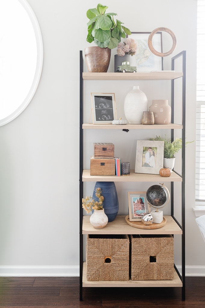
This shade is the perfect neutral gray without a distinct undertone. It leans slightly warmer, which I love because it’s a little different than many of the cooler tones throughout our home. It’s one of my favorite grays!
We’ve used this shade in Nova’s nursery.
6 – Valspar Cracked Pepper
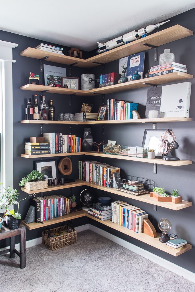
This shade is a true black paint. It’s dramatic, moody, and masculine. It’s perfect to create a ton of contrast. I was worried that painting an entire room black would make it feel small and cave-like. But once we got it on the wall, it honestly doesn’t feel dark at all.
We’ve used this shade in Ben’s office.
All of these paint colors together create a calming feeling in our home. I love the whole home color scheme that we’ve created in this house.
Which colors are your favorites? Do you have a go-to paint color in your home? I’d love to hear some of your favorite shades too.
