Ever since I shared my plans for the living room, I’ve been on the hunt for that “it” piece. You may by thinking, what is an “it” piece exactly? Well, when I was looking through my Pinterest inspiration board for the living room, I started to notice one common element in most of the pictures. A focal point!

Most of the time, a focal point in a living room is the fireplace. Normally, the fireplace and the mantle draw the most attention and anchor the living room. Unfortunately, we have no fireplace in our living room. We don’t really have a focal point at all.
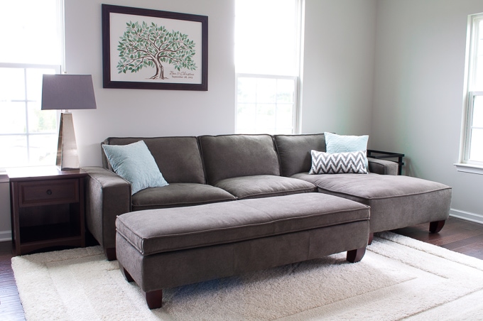
The living room is a little boring. The main problem is that when you walk into the room, the first wall you see is the wall that the couch is on. The only thing that we have on that wall is a framed picture of a tree. It’s actually the guest book from our wedding. The tree print has a lot of sentimental value for me and I love it, but it just isn’t the right piece for that living room wall.
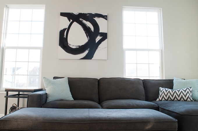 So, I went back to my Pinterest inspiration board looking for ideas to replace the tree print and bring in that focal point – the “it” piece. One thing I noticed in a lot of my pinned images was my obsession with black and white bold abstract art. I love the high contrast look of black and white and I think that abstract art really makes a room feel modern.
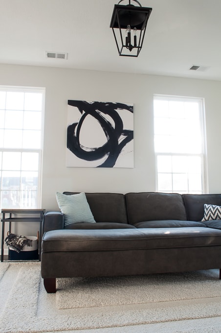
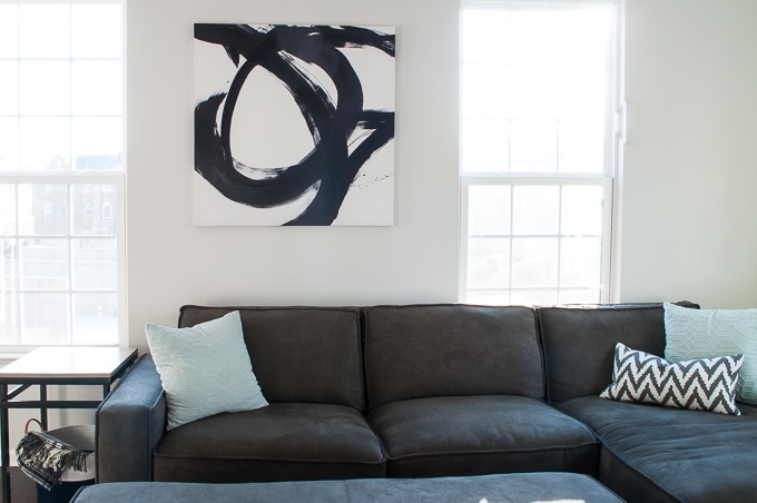
The other day when I was shopping in Kirkland’s, I spotted this canvas. It looked exactly like some of the abstract art that I had seen in my Pinterest inspiration photos and I couldn’t believe that I found a piece so similar!
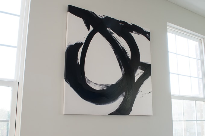
The minute I saw the canvas I knew that it would be perfect in our living room. I had found my “it” piece. The only problem was the price. Most of the other canvases that were this size were $100. I couldn’t imagine paying that for something that is basically just black paint on a white canvas.
 I started thinking of all my options. Maybe I could DIY one myself, and it might not look exactly the same, but I could try. I could check if there was a Kirkland’s coupon and get some sort of discount.
I stood there just thinking for a while and then I picked up the canvas to carry around the store and noticed an orange price tag on the back. That’s right, it was on clearance! It wasn’t even in the clearance section it just happened to be marked down. The best part was that the price was $39.99. SOLD!
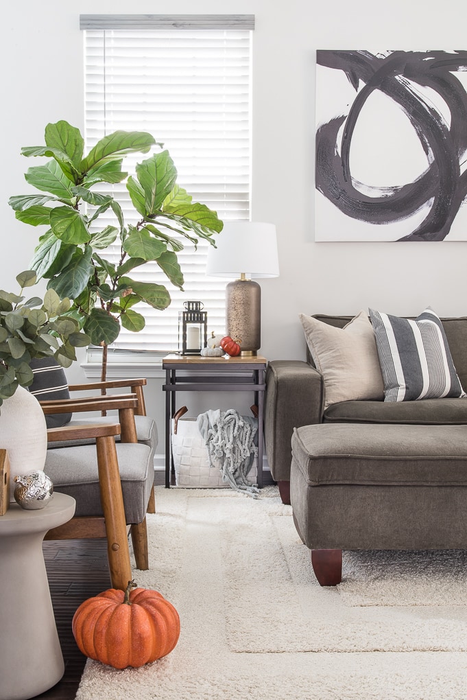
 I think this piece was made for our living room. It’s perfect and exactly what I was hoping for! From the moment you walk into the space your eyes are drawn to the bold design. It anchors the space without feeling heavy or busy.
I love the tone that it sets for the living room. It feels like a completely different space from before and one step closer to the room that I’m imagining!

This officially knocks one thing off our to-do list for the living room – Adding Statement Wall Art above the Couch. We’ve also been working on a few other projects for this room. One project, in particular, you can see in these photos, and I’ll be sharing it with you very soon! 🙂
So, what do you think? Do you love this abstract wall art as much as I do?




One Comment